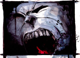
Although i like the old poster/ stained paper idea i feel for an article in a magazine the plain white background might be more suitable, giving me the chance to work with a lot of negative space


The BNP has been using the old British symbols of WWII, i wanted to take that idea as i had with the first attempt by using the stained coloured paper to suggest an aged poster, and worked more on the layout once more.


I Tried to make the illustration stand out more as being BNP and wanted to show the poisonous words pumping through the veins i feel that one phrase sums it up nicely, however i was not comfortable with the layout so I developed it further.


This was an illusatration based on a BNP article, the main thing that stuck out in the article was a sentence something along the lines of "racism and hatred running through the veins of the BNP" so I came to the idea of the heart of the BNP being poisonous and deadly, however my tutor at uni didn't like this final piece so as u can see I developed it further.


